· patched
Visualising distance from the main sequence and other Clean Architecture metrics in Java
Generating Uncle Bob’s abstractness and instability graph for a real Java codebase with JDepend, plus a small tool to make the output readable.
- Java
- Software Architecture
- #abstraction
- #coupling
- #clean architecture
- #software architecture
I must not have been the only one to read “Clean Architecture” by Uncle Bob (Robert Martin) and be immediately sold on the abstractness, instability, coupling and main sequence metrics. I must not have been the only one to immediately Google for tools to generate them for whichever codebase I happened to be working on at the moment, anxious to see if my refactoring instincts could be backed by a pretty diagram. And yet, based on the very disappointing (lack of) results, it seems like that might be the case.
There are a few tools for the job, yes, but they are clunky to run at best, and they definitely don’t produce a visual output you can quickly get insights from.
After hours of tinkering and finally getting a result, I thought I would write this guide for others like me who might have gone through the same experience. Hopefully it will save the next person some time.
A refresher: what is the main sequence?
The metrics come from a 1994 paper by Robert Martin, and they describe packages rather than classes. Two of them do the work:
- Instability (
I) is the ratio of outgoing dependencies to total dependencies:I = Ce / (Ce + Ca), whereCecounts the packages this one depends on andCacounts the packages that depend on it. A package that uses everything and that nothing uses scores 1: maximally unstable, and free to change. A package that everything depends on and that uses nothing scores 0: maximally stable, and painful to change. - Abstractness (
A) is the ratio of abstract classes and interfaces to all classes in the package. It runs from 0 (all concrete) to 1 (nothing but abstractions).
The argument is that these two should move together. A package that is hard to change had better be abstract, so it can be extended without being modified; a package that is easy to change had better be concrete, since nobody depends on it anyway. Plot A against I and the ideal is the diagonal A + I = 1 – the main sequence.
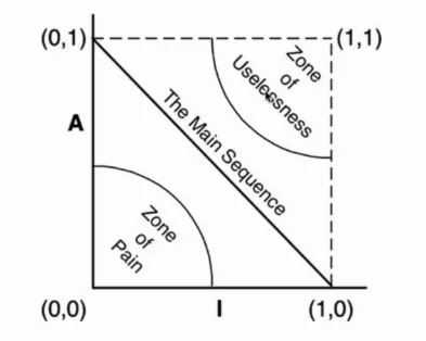
Real packages sit somewhere off that line, and how far off is the third metric: distance from the main sequence (D), calculated as D = |A + I - 1|, from 0 (right on the line) to 1 (as far away as it gets).
Distance alone doesn’t say which way a package went wrong, and the two corners are wrong in opposite ways:
- The zone of pain (bottom left: concrete and stable) holds the things half the codebase depends on and that offer no seams to extend. Changing them hurts, so eventually people stop changing them.
- The zone of uselessness (top right: abstract and unstable) holds abstractions nobody calls – interfaces still waiting for the implementation that never arrived.
That is the graph in the picture above, and the rest of this post is about generating it for a real codebase.
Let’s begin!
Step 1: Installing JDepend
Fortunately, most of the heavy lifting has already been done by the authors of this really nice tool: https://github.com/clarkware/jdepend. It will allow us to generate a report of our package dependencies in XML format (which we’ll need for our visualization).
From the documentation:
JDepend traverses Java class and source file directories and generates design quality metrics for each Java package. JDepend allows you to automatically measure the quality of a design in terms of its extensibility, reusability, and maintainability to effectively manage and control package dependencies.
From the JDepend README.
Unfortunately, there is not much more information than this in the main README file. Proper installation instructions are buried (you would need to download the repo and then open the HTML doc files in a browser… ugh), and they are a bit complicated. I’ll list them here so you don’t have to look for them.
First, we want to make a folder to use as our JDepend workspace, and open it in our terminal.
Then, we want to download the latest major release as a zip file (the URL points to the zip in the dist folder of the repo):
$ wget -O jdepend-2.10.zip https://github.com/clarkware/jdepend/blob/master/dist/jdepend-2.10.zip\?raw\=trueThen unzip the file:
$ unzip jdepend-2.10.zipSet the unzipped directory as our $JDEPEND_HOME:
$ export JDEPEND_HOME="$(pwd)/jdepend-2.10"Finally, we will need to change the file permissions:
$ chmod -R a+x $JDEPEND_HOMEAnd add the jar file in the unzipped folder to our classpath:
$ export CLASSPATH=$CLASSPATH:$JDEPEND_HOME/lib/jdepend-2.10.jarCongrats! JDepend is now ready to be used. (Yes, this was the simplified version).
Step 2: Generating the XML report
In the documentation we see that:
JDepend provides a graphical, textual, and XML user interface to visualize Java package metrics, dependencies, and cycles.
However, if we take a look at the graphical interface we realise that it is a bit… old-fashioned.
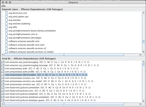
And it’s very far from the beautiful diagrams we imagined while reading Clean Architecture anyway.
The textual interface also doesn’t help much:
--------------------------------------------------
- Summary:
--------------------------------------------------

Name, Class Count, Abstract Class Count, Ca, Ce, A, I, D, V:
org.springframework.jms.annotation,0,0,1,0,0,0,1,1
org.springframework.jms.config,0,0,1,0,0,0,1,1
org.springframework.security.access.prepost,0,0,4,0,0,0,1,1
org.springframework.stereotype,0,0,56,0,0,0,1,1
org.springframework.test.annotation,0,0,1,0,0,0,1,1
org.springframework.test.context,0,0,3,0,0,0,1,1
...
But fortunately, JDepend can also produce its output in XML format, so that we can use it to generate any other kind of visualisation we like.
That is exactly what we are going to do with this command:
$ java jdepend.xmlui.JDepend -file report.xml <path-to-the-root-of-your-java-project>/buildThis should produce a report.xml file. We’ll see how to produce the visualization in the next section.
Step 3: Installing JDepend-UI
jdepend-ui is a little JavaScript-based tool I hacked together to transform the XML report into a somewhat useful HTML page with some insights, that can be more easily navigated than the old JDepend interfaces.
All you need to do to install it is clone the repo:
$ git clone git@github.com:ValentinaServile/jdepend-ui.gitMake sure you have node and npm installed, and run:
$ cd jdepend-ui && npm installStep 4: Generating the final report
Now that jdepend-ui is installed, we can use it to generate a much nicer HTML visualisation.
We can do that by running the command:
$ npm run jdepend-ui <path-to-xml-report-file> <your-packages-prefix>Where the path to your XML report should be ../report.xml at this point (if you have followed all the steps in this guide to the letter).
Your package prefix is something like “com.yourcompany.yourservice”. The tool will use it to filter out the metrics that belong to external packages so that you only see the ones which you actually wrote.
If everything went okay, you should now have an index.html file in your working directory.
If you open it with a web browser, you should see something like:
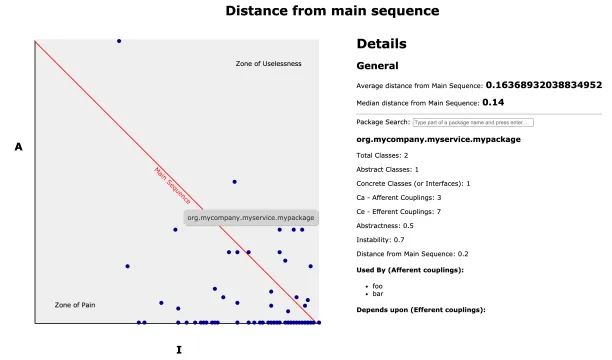
On the page you can see the same graph we saw in Clean Architecture, generated from the JDepend metrics. Every “dot” on the screen represents one of your packages. There is a “general” section which has the average and median distance-from-the-main-sequence scores for the entire codebase.
If you click on any of the dots, package-specific details will appear on the right side of the screen: the package name, its coupling counts, its abstractness and instability scores, its distance from the main sequence and, finally, a list of which other packages use it and which ones it uses.
You can also search for a package by name with the search bar.